Contrast Lesson
Assignment in class: Classmembers are give photographs against which they must select type style and color to gain the appropriate amount of contrast to contribute to legibility, but to prioritize the items one notices on the page.

Lidia Bertolini's composition here is absolutely fantastic. The photo is spectacular, and it's one that Lida took herself! The type style is very appropriate for the message, and more importantly, it's positioned and crafted in a way to maximize contrast, yet maintain a lacy, almost ethnic look and feel.
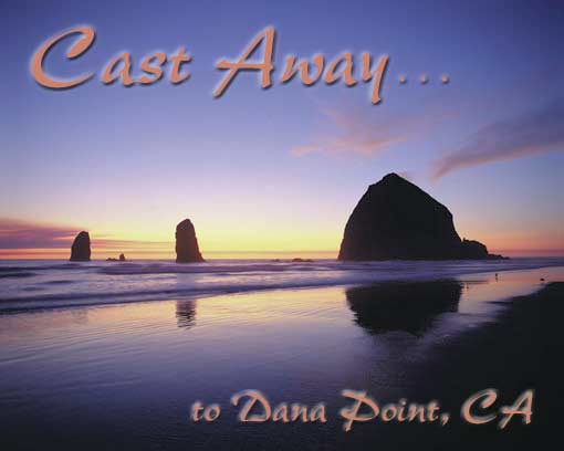
Erin Oleson's Cast Away graphic is outstanding for it's selection of color to create contrast, yet maintain a lovely set of values that integrate the type with the image to make a single, well-conceived composition.
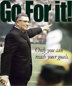
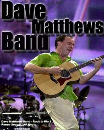
John Brosius: Fabulous lettering styles here. The big bold type is placed behind the head of Vince Lombardie, making it appear that he is commanding his team... that this is his voice. The second type element confirms what the viewer knows to be true, but it's a whisper compared to the top line.
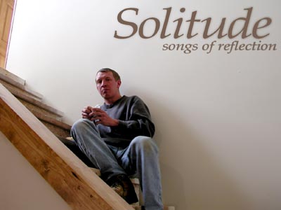
Rhonda Prellberg did an extraordinary job here, and the color of the type as well as the type style and position are very effective. The word and photograph's naturally effective composition work so well harmoniously. The lettering looks as though it was painted on the wall which I really like.

Sheena Strouf. This would work extremely well in a magazine layout... double page. Good positioning of the type. But look how the words ascend in size. The list of the top three items is smaller, but they build to the ultimate truth about life on this tropical destination. No Worries! Love it.
Jason Betke has got it goin' on with this black letters on dark value background, but they work because they are bold and enhanced in Photoshop to make them readable.

Rebecca Meana should be in the greeting card trade. Because the type is pink and is less contrasty than the puppies, the dogs become the instant center of attention as the viewer gazes upon the scene. Your eyes then go to the second item on the composition, the lettering and the message. Now everyone go awwwwwhhh.
Kay Heller has prepared an excellent layout that would be most appropriate for a book over or an ad. I love the lettering at the edge of the photo which enhances the message.
Jessica Pusateri has got a whacky thing going on here, leveraging Photoshop's capabilities to create a great typestyle, embossing it to enhance the contrast between the lettering and background.
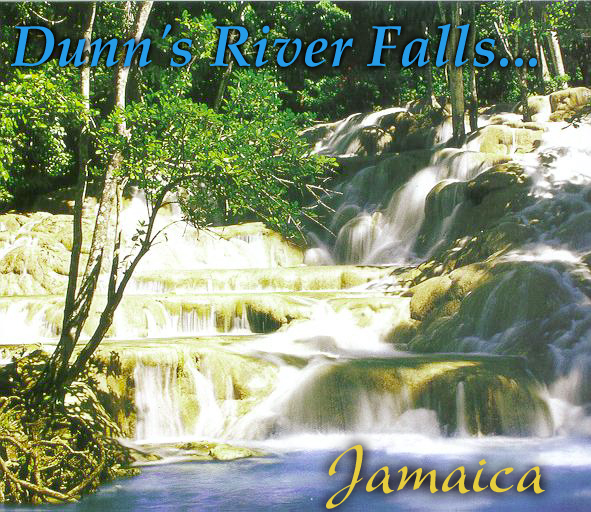
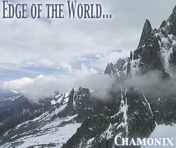
Tara Griffin. This photo is fabulous, and the lettering and layout Tara chose is on target. I love the blue letters at the top. She's not going for maximum contrast, and that's okay. This would make a great brochure, book, or magazine ad concept. The eyes are first on the falls, of course, and then to the type above because it's larger than the type at the bottom. It probably gets equal attention in either case. If the type at top were more contrasty, say white, it would minimize the importance of the lovely falls as an attention spot.

Courtney uses graphics like a poet uses words. She performs the seeming impossible task of contrasting color and type against the exploding fireworks, but it's done here perfectly.
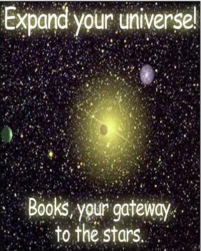
Craig Skubic did a wonderful encourage kids to read poster here. I like the subtle glow characteristics on the letters. Very appropriate.