![]() |
|
|
Client Page 4 See Client Page 1 | See Client Page 2 | See Client Page 3
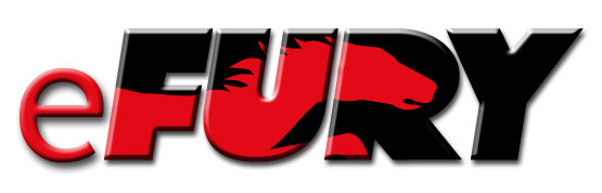
Here's an interesting logo I'm working on for a company. When I see the name Fury, I see these colors and this horse. Stark contrast and an image evocative of unbridled energy and enthusiasm are what I'm after here. The client is reviewing it right now, looking for consensus. Whatever happens, I think this is pretty good for the portfolio. Sometimes I don't submit more than one idea to a client, especially if it's a strong one. Than we can build on this. I call this "My Best Idea And I'm Sticking To It" Approach.
Here's a Magazine cover I just completed for a Dubuque area magazine. The subject, Bill Cosby, was painted from a plublicity photo Gary obtained from Cosby's management. Bill is appearing in Dubuque late February, sponsored by Loras College. The painting, an oil, was completed on unstretched canvas. The background of the piece had to be lightened to improve contrast of overlaying type. Easily done on the computer once the image was digitized. I used a new oil paint for the first time. It uses a synthetic oil that can be thinned with water! I've been working in oils for years, but I love new products. I'm staying with these. Gone is the smell of terpentine and mineral spirits for which I'm grateful, yet there is no sacrifice in handling and look of the finished product.
See More Client Projects on Page 2, 3 and 4 |
|
|