|
Click this to the SnakeEye Salsa image download page. Our text book
Lecture 1 Notes: Brand Marketing Lecture 2 Determining Look and Feel Project 2 Developing Look and Feel Individual Project: Sweet Baby Ray's Lecture 6 The Brochure Concept Lecture 9 Smartwool Look and Feel
Download Slow Buffalo Graphics
|
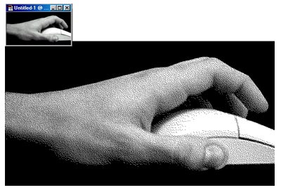
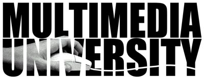
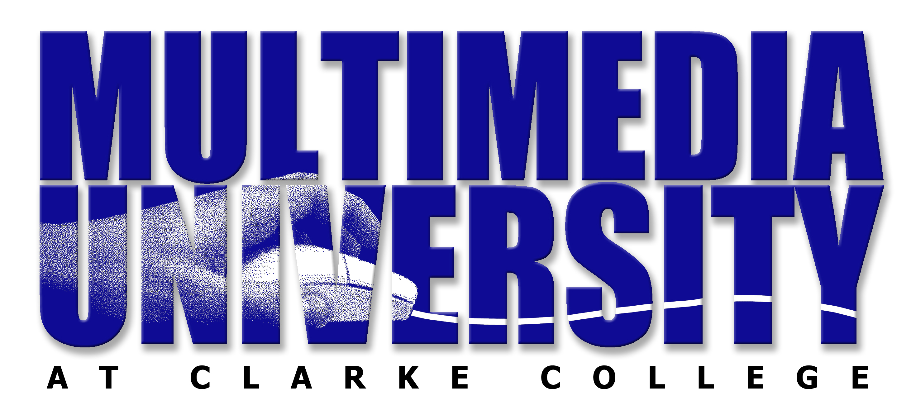
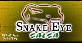
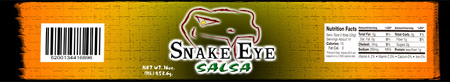
I have established a recap of student projects headquartered on this Web site. I'm not exaggerating when I tell you that I've had a succession of some of the most talented students I have ever had the privilege to teach. Because my classes are getting larger, I've had to modify the course to accommodate the many and varied learning styles I've encountered. I really enjoy teaching this particular course the most because it gives me a lot more latitude to be creative. I've been dividing the class into teams and providing creative projects for each team on which to collaborate. In one of my classes, one team had to create a concept for a food product... including name, label graphics, billboard and ad samples. The product became SnakeEye Salsa. Another team had to develop an identity and ad samples for a very technically sophisticated product called the Clarke College Webcast Network. A third team had to develop an ad campaign for a new school aimed at business communicators called Multimedia University. The products and services are listed below including some of the team's samples. There are also links to take you to pages or PowerPoint files dedicated to these projects. They are delightful. In fact, they were so good, I felt it was a shame we didn't have an actual opportunity to make these ideas a reality. For example, check out the following Web-based project prepared by one team who had to develop a look for an exciting new concept, "Multimedia University.": You better mark this page so you can get back here from this set of Web pages.
Then there is the Webcast Team. What's a Webcast you ask? Webcasting is video and audio programming and productions that can be deployed on the Internet. It could be a wonderful way of extending Clarke College's reach to its alumni, family members and friends around the globe. Find out more:
Click on the logo above and you will deploy a Powerpoint program in your browser that was used by our Clarke Webcast Network team. The Salsa Team is in the process of forwarding their work to be posted on this site. Mark this page and come on back!
This Class Okay, gang: What follows is a continuous stream of my lecture notes from class to class. At left is a hyperlinked list of dates which you can use to jump to a specific class. Handy or what? This will be particularly useful when preparing for the exam at the end of the quarter or if you should miss a class. If you are compelled to print these notes out, fine, but because it is a contiguous document, you may end up wasting a lot of paper from week to week. Here's a tip for printing the notes: Simply highlight and copy new material that appears here from week to week, and paste it into a word processing program (Word works best since it will maintain formatting). Then print it. Lecture
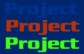
1 Notes: The free-enterprise landscape is all about brands. We live in a highly visual and multimedia environment. There is a seemingly endless barrage of brand names and symbols that quite quite literally dance in and out of our view. Some are obvious, like a 14 x 48 foot outdoor sign you drive by every day to work. Some are subtle still prominent, such as product placement in a motion picture where the brand becomes a prop. FedEX packages and the logo are not just prominent in the Tom Hanks film, "Castaway," but they are an integral part of the story. Everyone knows what FedEX stands for... delivering packages on time, and it is so perfectly logical for the main character to be obsessed with time. It is his obsession, this symbol of what forms the character, and it is so eloquently captured in a simple logo on the side of a truck, embroidered on a jacket, the hat Tom Hanks wears, and, of course, the packages that wash up on the shore of the deserted island upon which he is cast away. Brand becomes an invaluable story element. Take a walk down a typical supermarket aisle. There are literally thousands of brands, logos, trademarks, packed on the shelves, all competing for your attention. It's surprising how many of the brands you see are comfortably familiar. What often motivates you from selecting one variety of soup over another is a product of how well the brand's marketing agents informed you of the brand's virtues. That brand was beamed to you via a television commercial perhaps that tucked the image into the corner of your brain while you watched an episode of Survivor on CBS last week. Developing a logo or trademark can be simple or complex depending on the number of people involved in the process and the credibility of the designer or design firm working on the logo. It is a process of collection, projection, and distillation. Like all design exercises, you must determine the product's "look and feel." Chances are your logo or trademark is evocative of something familiar to the target audience. As an example, if you're designing a logo for a bottle of hot sauce, subtle variations of color would probably be less successful than more dramatic contrasting colors on the packaging. If your sauce is designed to evoke ethnicity or a region of the hemisphere like Latin America, than colors popular in that region's culture would be logical for your product's logo. Finally, the advent of the Web has fueled the need for equity making brands.The Web is all about brand marketing because it is a highly visual medium. Also, because the Web is still a frontier, brands are essential in building a consumer's confidence. One of the challenges in creating an effective logo is making it easy to recognize without being too derivative and jejune. Many times, in working with a customer on a new product logo, I asked, "Do you want to look similar to your competitors or totally different from your competitors?" In almost all cases, the client will respond, "I want to look totally different." But when the design is executed, and it diverges too much from what other familiar companies are doing visually in the marketplace, the client balks. In retrospect, no client wants to appear "uncreative" or unwilling to take a risk with an exciting new visual. But be advised, ask the question at least twice, and seek absolute clarification. The question should be worded, "Is it important for your customers to be able to recognize a look and feel that has become a standard in your marketplace? In the textbook publishing field, for example, the use of primary colors in a Web site spells "k-12 marketplace" and won't be desirable among publishers in the secondary education marketplace. There are three design elements of a logo or trademark which include: 1. Symbology - what is the logical symbol that could be included? 2. Colors - What is the color scheme of our trademark? Is it four color process or a collection of spot colors? What is the manufacturing process that will be used to portray the logo on a package? If it's woven hemp seed bag on which only two colors can be silk screened, then four color process is not practical. 3. Logotype - What type style will best portray the name of the product. Will is be incorporated into the logo in a special position? Will the symbology ever be separated from the logotype? Should we develop our own unique font for our logo or trademark? Less obvious considerations include: What are the various ways the logo will be portrayed besides in print and on labels? Embroidered or screen printed on textiles such as uniforms or promotional items? Personally, when I design a logo or trademark, I ask myself the following questions? 1. How does this logo look on a 3-inch business card? 2. How would this logo look embroidered over a shirt pocket? 3. How large can my logo appear on an outdoor sign such as a 14 x 48 foot sign? 5. How can my design work on a vehicle such as a pickup truck, van, side of a city bus or semi-tractor trailer? 6. How does my logo look on television, but more importantly, how can my trademark be animated for a television commercial. 7. How does the logo work on a Web site? How does it work as button? How small can I make the logo and still maintain recognition? Project Assignment: 1 The Logo Your first assignment is to develop a logo for one of the following products or services. In some cases, the product or service is one that has been around for a while. It will be your job to create a new and improved look. 1. The Multimedia University at Clarke College. This is a school within a school product which will be marketed to companies and organizations with creative departments. The concept is to provide both on-line and workshop/campus-based multimedia technology emersion courses with an emphasis on creative problem solving. The logo will be used in print, on the Web and animated video clips. 2. Clarke College Webcast Network (CWN at Clarke College, or Webcast Network, or WebNet at Clarke College, etc.) This is a logo which will be usedin print and online as a static graphic and animated video clip. The Webcast Network will provide live and streaming video via the Internet for the at-large Clarke community. 3. Salsa Cooked over an Open Fire. This product is unique among the three listed here because the name hasn't been decided upon. We thought we would leave this up to the design team. This is a product that was born over a backyard barbecue involving large buckets of bumper crop tomatos. The product became popular among friends and family, and now retailers are asking if they can stock it. The logo will be used on label caps as well as jar labels, as well as print and online.
Determining Look & Feel You are assigned the responsibility of formulating an advertising campaign. What information do you need to know to determine look and feel? Let’s compile a list... Product or Service?
What’s the Marketing Plan?
What does the packaging look like?
What is the product’s legacy? How long has it been marketed?
Who is the target audience? Who is the primary demographic or target market? Is there competition? If so, how is market share divided among competitors? Secondary Market… who is a potentially untapped resource that can grow our sales if we appeal to them? Does it transcend cultural or gender lines? What publications are in our mix? Mass media vs. targeted media Intrusive vs. Non-intrusive advertising Intrusive vs. Non-intrusive Advertising The task of every advertising team to is to develop an ad that will attract attention and motivate the viewer to think or act a way that is favorable to the product. For purposes of this design class, we have divided advertising design strategies into two basic categories: Intrusive and Non-intrusive. For example: Publications such as Time Magazine and USA Today are mass marketed to a broad audience. Advertising. people read these publications for news and not for the advertising. Consequently, competition to capture the reader's attention among the pages of such publications is strong. A copywriter and designer must quickly capture the reader's attention, often in some provocative way. Your ad is "intruding" in their news and feature space. One could say the epitome of intrusive advertising is television commercials with the possible exception of infomercials. On the other hand, a publication which is targeted to a specific group, such computer enthusiasts, actually welcomes advertising as a source of valuable information, almost as important as the news and features contained in the publication. Thus, it is logical to assume that ads can contain much more information to help readers make purchasing decisions. However, such publications are often filled with provocative advertising among what appears to be highly competitive advertisers. Particularly if there is price competition among a product category (catalogers for example), ads become highly detailed price listings. Bottom line, of course, is they work among a classification of readers who are price shoppers. Excellent examples of non-intrusive advertising can be found in magazines such as Sports Afield, Women's Day, InfoWorld, PC Magazine where ads are often disguised as editorial. Daily Newspapers can contain both intrusive and non-intrusive advertising. Advertising supplements for the local food store, filled with coupons and specials, are non-intrusive to the household manager looking to save on groceries and home cleaning products. On the other hand, a full page ad for the new Plymouth Neon embedded in the middle of the Sports Section, is most certainly intrusive. The automobile dealer display ads in the automotive section of the classifieds are non-intrusive among car shoppers who are often attracted to such sections when looking for a bargain. We will use the terms intrusive and non-intrusive advertising to quickly determine our ad campaign's overall look and feel. Legislation and Obligations
Team Organization: Assigning Responsibilities and Matching Talent with Tasks Managing Collaboration: The team must divide up responsibilities along areas of expertise. Project Manager as well as other key appointments to handle the group's obligations and responsibilities: Project Manager Production Manager Graphic Designer Photographer/Illustrator Researcher Copywriter Copy Editor Comptroller (the person who handles the money) (Depending on the depth of your talent pool and numbers on your team, you may combine any two of the above positions into one appointment.) The team must process its tasks and meet their objectives. There are four types of management tasks in any creative enterprise: 1. Managing Assets and Agendas: How to organize and manage the visual design process through assessment of known assets, marketing objectives, client and staff agendas.The most important responsibility, perhaps, is mediating any conflict that may arrise and moving the group toward consensus and the most effective product the team is capable of producing. 2. Managing Compositional Elements: How to create and use design software for the management of compositional elements for maximum visual impact and clarity of information. 3. Managing the Message: How to determine and ensure information is being effectively transferred to the viewer. 4. Managing the Process: How to manage the ad production process which includes media specifications from reproduction technologies to paper stocks, from direct marketing and display advertising to the new media and World Wide Web. Appoint a Project Manager: someone on the team who will manage the schedule and make sure deadlines are met, and that team members have the resources necessary to complete their assignments. Production Manager: someone on the team with knowledge and abilities to take a design and get it to either hard copy or compatible file format for target media (print, Web, video, etc.). The Production Manager is also in charge of coordinating the presentation materials for class. This is not a solo performance, however. The Production Manager must seek help and expertise when appropriate. Copy Editor: someone on the team in charge of final copy development. Everyone on the team will contribute in terms of research, brainstorming, copy development, etc., but one person on the team must take responsibility for final copy editing and submission Researcher: This is pivotal in the development of the marketing message. Photographer/Illustrator: Responsible for the actual art and photographic production. Comptroller - Handles the money which includes credits, debits, share holder investments, and the balance sheet at the end of the course. The comptroller keeps complete records of transactions and inventories the team's assets (digital cameras, scanners, software, hardware, etc.). It's important for the team to get a handle on its capabilities and resources. First Level Project Goals: The team is responsible for taking the contributions of the group and distilling them into the most effective concept. Here are the team's project goals: Logo design which requires developing a production-ready graphic. What is a prodution-ready graphic? One that is ready for target media distribution or manufacture (as in packaging). Look and Feel: this transcends the logo design to prototypical ads and packaging concepts. A color scheme and some texture samples evolve from those colors used in the logo, perhaps. Target media is selected for tests of the look and feel. With the Web cast network and the Multimedia University, your target media may be more electronic like a Web site. With a food product (the salsa), a package design, display ad or poster would be most appropriate to pursue. The
Text Book
Every client has a story to tell, and it's your job as a designer to find out story the client wants to tell. Research Strategies: Discuss the strategies one must take to reveal precisely what the customer wants. Q: What are the four basic elements of design? A: Line, Shape, Type and Texture. Q: How do you use lines and what are four things they evoke? A: Strength, Mood, Organization, Texture
Chapter 2: Typography BOLD, ANGULAR CAPITAL LETTERS SHOUT! while thin, curvy letters in upper-lower case whisper. What are the five considerations when choosing type? Chapter 3: Contrast Contrast doesn't just make a design visually engaging, but it is a prime organizing factor for a design's information. Contrast Via Shape Contrast Via Value Contrast Via Color Chapter 4: Layout A design's layout is a map for the viewer. The Elements of a clear hierarchy Chapter 5: Grid Systems Invisible except to the trained eye, grid systems are a subtle but vital part of the design process. What is the reason for a grid system? Chapter 6: Identity Design: Logo & Logotypes Recognition is what every company or organization wants. Chapter 7: Critique and Analysis Critique and analysis actually opens your eyes to infinite possibilities.
The Importance of Shape in Layout and Design Shape: A good composition is an evocative arrangement of shapes, and sometimes it can consist of a shape within a shape, within a shape, all of which combine to direct a viewer’s attention, evoke a mood, condition a recognition response (logos and brands). Name as many design elements as you can that can convey shape: Photograph, illustration, logo, trademark, borders, type elements, lines, blocks, headlines… What five things should you consider when using shape What is a texture? It is the fourth element of design, which is defined as an object’s visual or tactile surface characteristics and appearance… In graphic design, texture is most often used as a secondary element to reinforce an idea, rather than as the primary element to communicate a concept. Some examples of how texture is used in design: Special paper stocks, embossing and foil stamping, solid spot color, intaglio or mezzotinting, dramatic use of black and white photography opposed to color can be interpreted as a textural element. What are the six considerations when using texture? Class Notes #9: Strategies for Developing Effective Advertising Copy This lesson is designed to help you develop a strategy for crafting your advertising copy. Though in a display ad, the copy portion may be extremely brief (like on an outdoor advertising sign or Web page ad banner), it must evoke the value to the consumer or target audience of the product or service you are promoting. So what will be your fact finding strategy as you sit across from your client and discuss your advertising approach. Time is precious, and you want to be as effective and productive as possible during these meetings. What follows are some guidelines to help you get started and motivated. Assuming you know nothing or very little about your client's product, or you may know a lot, this is still and effective way to organize your material. The Three Value Propositions: There are three kinds of company values. Each represents a strength, a core value, which propels the company through every decision and innovation. These are called "Value Propositions" and they Product Leadership, Operational Excellence and Customer Intimacy. Can a company possess more than one of these value propositions? Yes, but one will emerge as the leading value above all others. This is what you, as a copywriter, need to exploit. When asked to think of a company that embodied Product Leadership as a value proposition, several in the class suggested Nike. However, the problem with Nike of late is that they have lost marketshare to increasingly innovative competitors, and have had to deal with negative fallout from their overseas "sweatshop" associate suppliers (Nike allegedly owns no manufacturing facilities itself, but contracts all their shoe and sportsclothes making to overseas suppliers). This would be legacy information that may lead you, the creative resource person, to develop an advertising concept to counteract the negative, or at the very least, accentuate the positives. So what will be your fact finding strategy as you sit across from your client and discuss your advertising approach? Time is precious, and you want to be as effective and productive as possible during your fact finding mission with the client. What follows are some guidelines to help you get started and motivated. Assuming you know nothing or very little about your client's product, or you may know a lot, this is still and effective way to organize your material. Product Leadership: Is your client promoting Product Leadership? What company comes to your mind when you think of Product Leadership?
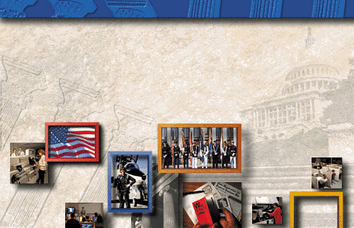
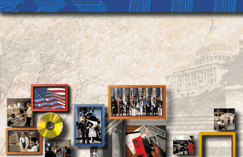
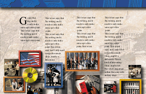
Class Notes #10: The Brochure Concept We started class with an engaging demonstration of how line, type, shape and texture all factor in the execution of a brochure design I had worked on the previous week. I saved all of the intermediate steps to show how the concept evolved from idea to finish. It turned out to be a perfect example of how line, type, shape and texture can combine to create a particularly evocative communication piece.Here was the challenge. I had to create a brochure for our newly formed Washington, DC sales group. This team works in the Washington area looking for new business opportunities for the company for which I work as a creative. Here are some of the problems I had to deal with: 1. Even though our company is headquartered in the Midwest, the brochure should look like a company doing business inside the beltway. Images of Washington landmarks are preferred over company images that evoke the heartland. How can we suggest Washington without looking like so many other companies doing business in our nation's capitol? 2. Our company offers many services, so many, in fact, listing them all in a brochure makes for a lot of copy not to mention confusion among certain customers. I mean, does a Defense Department customer need to see social services type images in the brochure? Likewise, do brochures targeting the Internal Revenue or Department of Labor customers need images of military personnel? A brochure attempting to target all possible audiences may risk being too general, too abstract and unfocussed. This is where a designers knowledge of available technology comes in handy. For example, if you know about POD (Print On Demand) that utilizes database technology which can assemble customized brochures in low volumes, each brochure with slight variations designed to appeal to a specific recipient, you can solve a lot of problems. For example, I can design a fairly complex layered assemblage of images each on their own editable layer in PhotoShop. I can add and subtract images at will, saving the images as .EPS files. Then, I can bring in the appropriate illustration into Quark Xpress, a page layout program, in which I lay the customized text over the top of my imported illustration. There is software that can store and place the illustrations in batch processed print orders, producing full-color customized brochures of infinite variety, all without separate setups. I won't kid you... this kind of thing takes some time on the front end to do well, but it's worth it. We're not building a brochure, but a communications tool. And think of all of printing we will save money on because we are not storing it in some warehouse were it becomes obsolete in a week and most are ultimately unused and discarded! So now, we have to build a design that works with this kind of flexibility. First, the cover treatment. I have a general idea of how the entire brochure will look. I want to use texture in the form of light limestone, the kind used on exteriors of some federal monuments. I also want to use the deep dark blue of our own company colors. I'll reserve that for the cover, which I want to be a study in contrasts.
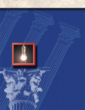
Here's my start. The columns represent my use of line. The angle is much more interesting than if I depicted them straight up and down. The columns are also evocative images that suggest Washington without showing an actual monument. The lightbulb would have been too much of a cliche if it were not as interesting as this particular piece of clip art. I used PhotoShop for the entire composition, and, as you may know, one of the great tools in PhotoShop is Render Lens Flair. This touch combined with the wooden frame I use as a design concept throughout the brochure, makes for an interesting statement. These frames, by the way, are actually made of wood which I made using my miter box and a saw in my home workshop. A little glue and some cardboard on the back, and voila! I scan the image and stain in PhotoShop. Sometimes low tech is better and faster than high tech.
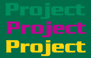
Lecture Notes #11: The Importance of Structure in Design Structure Q: What is Design Structure? A: Finding the appropriate use of the elements of line, type, shape, and texture to create a strong and effective design. Q: What are the FIVE primary principles of structure? A: Balance, Contrast, Unity, Value and Color Balance Q: In composing our design, is it our goal to achieve balance? A: No. True balance and symmetry lead to boredom. In a busy newspaper ad filled with two equal columns of line items, all details of the ad’s composition blend together in one gray shape. The viewer doesn’t want to work that hard to figure out what the designer is trying to achieve. Balance is all about creating mood When things appear slightly or especially radically out of balance, the effect evokes a variety of moods including humor, drama and tension. Symmetry vs. Asymmetry: Asymmetry (forcing a design element out of balance) can strengthen a design. By throwing a design out of balance you create tension. What should you consider when striving for balance? Contrast Effective advertising design is all about contrast. Contrast can strengthen an idea. There are several ways to achieve contrast Photography or Illustration Type Size and Thickness Color and Value What many neophyte designers fail to recognize is the effect a block of body copy has on the overall contrast of a design. What should you consider when striving for contrast? Unity How do you achieve unity in your design? Through the management or manipulation of value and color. Value Q: What is value? A: Simply put, it’s defined as the relative lightness or darkness of an object Value creates mood.
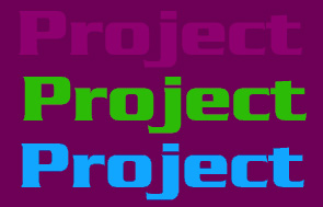
A: Movement and direction What should you consider when using value? Q: What does color add to a design? A: It adds dimension. There are warm color and cool colors Warm colors project while cool colors recede. 1. In the chips below, which colors project and which colors recede? 2. What pattern do you see in the chip sets below? How are the chips organized? 3. Note how the brightness of the colors change from the top chip set to the bottom. On the two lower sets, do colors still project while some recede? Or, do they all recede? Below are three color tests sampled from colors featured above. Note how contrast and value are more a product of juxtoposition of color, and how the combination of colors actually make what was considered a cool color go from a receding value to a projecting value.
Maroon actually warms up when against a darker value. Cool green actually projects against dark purple.
What do all three backgrounds above have in common? Below are two headlines. One is black and one is red. Popular opinion would dictate that the red type projects better than the black type and that it is more readable. But step back from the screen 10 to 15 feet, and which one is more legible? Color is the most challenging element to control Color is the most challenging element to control The red type, even though it is the same size and weight, is less legible, even against a white background. Why? Because red is less contrasty than black. Remember, legibility improves with contrast.This is why black type against a white background is the most legible type you can produce. What are the production challenges in working with color? Color is a design factor even if you’re working in black and white. Paper Stocks There are warm whites and cool whites In papers there are Gloss papers Matte papers Semi-gloss papers Dull enamel papers Flow-coat flood varnish Lamination What should you consider when using color? Class Notes 12: Classroom Exercise: Achieving compelling design through the manipulation of structure (balance, contrast and unity)
The product is the BMW X5 Sport Utility Vehicle. The fact we are featuring an automobile presents all kinds of opportunities since there is a so much more a car represents than merely transportation. There are lifestyle and status issues for example that can be easily exploited. By clicking on the BMW logo above, you can download a Powerpoint file with all the graphic elements you need to get started. Remember: Your composition must feature elements of structure including: Balance: How items are sized and arranged on the page. Assymetrical balance is most desirable to create drama, tension or excitement. Symmetry means boredom. Contrast: Contrast contributes to a layout's legibility but also the mood you are trying to create. Unity: Controlling Value and Color helps create unity in a composition. Class
Notes #13: Outdoor Advertising Outdoor Advertising is one of the oldest advertising media in existence. Until recently, most large pictorals were hand painted on the sides of buildings and on poster panels. Before outdoor advertising was even referred to as an industry, it was pretty much out of control, and in some metropolitan areas, a visual nuisance. For example, as circuses came through a town, every available space... on fences and barnsides... were covered with posters. "Bill posters" and sign painters plied their trade until civic beautification advocates passed legislation to control them. Many fences and buildings contained the words "Post No Bills" meaning no posters or signage allowed.
Today, outdoor advertising is a highly regulated industry. There are zoning laws which contain billboards in industrial and commercial areas. Actually this is good for outdoor advertisers because it puts their message right in the marketplace where people are shopping and commuting. Today, outdoor advertising has become even more dynamic a media with the application of computer graphic technology. Instead of signs being painted by hand, or screen printed by section, they are painted by computer using a process similar to a giant ink jet printer. Designs are often spectacular in scope with or protruding extensions that break the rectangular frame.
On relationships with clients: Most are risk averse. Some of the best ideas in outdoor advertising are by nature risky. A local designer and outdoor specialist once confided to a class of ours, "I designed this fantastic board with a giant screw. The caption was something to the effect 'Remember your last car deal?' It didn't sell the client." Often a client wants to put too much detail on a board which cannot be read when driving by at 60 mph. The best advertising designs work on an emotional level. That's what all advertising has to do, but especially outdoor. On design approaches:
Less is more in outdoor advertising. It's not what you put in a composition. It's what you take away. It should be a goal that you find the essence of a product. Often you don't even have to show the product to convey the message. One of the best samples was illustrated on a video which Kathy brought to class. On that video, a designer was describing the "Got Milk?" campaign for the American Dairy Association. The boards showed a giant cookie with a bite out of it and the message... "Got Milk?" Another board showed a pair of Hostess Cupcakes with a bite out of one and the trademark icing on top spelled the words, "Got Milk?" This campaign was deemed one of the most effective campaigns even though it never actually showed the product. On the three objectives of outdoor advertising: 1. Get attention with a simple idea. This means think visually. Do in picture rather than words. 2. Warm their hearts. Evocative images that make people smile or laugh are effective. Making people feel good is not a bad objective in creating memorable advertising. 3. Motivate action... whether it be to remember a particular brand name next time you're shopping or visiting that restaurant because you just saw the sign and you're hungry. Outdoor advertising is marketplace advertising and it's an important part of the total advertising or marketing mix. Often times outdoor advertising coordinates with print, radio and television. Why do radio stations advertise on billboards? Because there's a radio in virtually every automobile and truck on the road. On rules or no rules: It depends on the designer you're talking to, because some say there are no rules while others say there are rules but they are made to be broken. There are good practices, however: 1. Simple, easy to read 2. Contrast: Bold black type against a white background is the ultimate contrast, but there are a lot of color combinations that can work. It's important that you work with color and value to maximize contrast for the best legibility. 3. Images or graphics communicate visually often better than words. On writers: It's best to tell writers "forget you're a writer." Think visually.
Class Notes #14: How I Start Designing an Ad (step-by-step) As I make my way through teaching this course for the first time, I've taken note at how you manage (or don't manage) the design process. As I've said before, budgets and time constraints are so pervasive in the world of advertising design, there just is too much at stake and too many risks involved in not being productive and effective. This requires a combination of management skills as well as artistic talents which must be blended in a way as to leverage the talent, get the best results possible and maintain control over costs, schedules and the relationship with the client. So I created this annotated checklist that can be followed in sequence when beginning the design process. Of course this list is based on a first time encounter with the client. When you receive the opportunity to design an ad campaign, what are the first things you should do. What questions should you ask: What's the Target Publication? What are their ad specifications? Dimensions? Color(s)? Will I use four color, one color, spot color, black and white? What format files do they prefer? Quark? PDF? EPS? What are my marketing objectives? What is the client's agenda? Who will we be working with? What do we want this ad to accomplish? Phone call to a closer? Web visit? What are the assets of this campaign? Is there an established slogan? What is the distinctive visual? Packaging? Where’s the Ad Portfolio of past work on this product? What other media projects have been executed for this product? When is my drop dead date? Publication deadline? Now you can begin to draw up a master production schedule with deadlines as milestones. Schedule the first Brainstorming Session with staff. From this Brainstorming Session, we will determine the treatment with a one or more of our best ideas from this session. Draw up a design document which outlines the project from concept through production it must contain: Treatment: This is a one paragraph statement of the campaign's goals with the best idea(s) proffered by the Staff Brainstorming Session. Production Schedule and Deadlines Sample thumbnail sketches based on the treatment A Schedule of all Associated Costs of Production Copy of the Contract Establish the Budget and all Costs associated with design and production. Draw up Contract to be attached to the design document. Present the contract and design document to the client in a pitch session. Get the Contract signed. Begin Design and Production Class Notes #15: Look & Feel: Smartwool Socks
For those among us who think everything you can say about a pair of socks has already been said, are probably unfamiliar with Smartwool. This brand, which occupied a niche in the high-tech textile trade and, more specifically, the hiking and camping equipment marketplace, has grown to include a wider retail sales network featuring not only socks but new products such as hats, gloves and scarves. Smartwool calls its product line "next-to-the-skin wear." Their success is evocative of another textile business, Polarfleece. First and foremost, Smartwool is a remarkable product. Growth in its business largely came from customer word of mouth. Customers of the socks told their friends, Outdoor and equipment publications printed stellar and detailed reviews of their products. All of this is remarkable because the socks are premium priced. While other sock companies (Burlington, Gold Toe, Hanes, et. al.) are competing in the discount price arena, Smartwool is taking a much high road.
Color scheme: The Smartwool color scheme can best be described as primitive chic. The look evolved from its hiking and camping marketplace, where many companies have similar L&Fs. The orange, pea green, and black are in perfect harmony with one another. The green is an accent color that says outdoors... trees, grass, verdant hills or mountains. The orange background is the dominant color which says sunrise or sunset. The clouds are rendered in a lighter shade almost as if they were sponged on in translucent white. A darker orange shows a meandering thread or it could be a circuitous route on a hand-drawn map. The Logo: The logotype is hand written as if painted on by a worn-out brush, and the hallmark of the logo is this glyph of a man in a broad-brimmed hat, a figural that is not as nondescript as one might think. The broad-brimmed hat is indicative of a human who knows the value of protection from ultraviolet rays. Someone obviously this smart takes care of their bottom extremities as well. The entire look is also evocative of America's Southwest, still a place that is highly symbolic of the best that is America... the wide-open spaces, the pioneering spirit, the legacy of risk-taking, the scarcity of water and harshness of life in the open spaces, life on the edge... but hey, I've got my Smartwool socks so at least my feet will be safe!
On the left of the logo is a scribble which obviously a ball of wool thread or yarn. The ball unravels to form the logotype "Smartwool" which passes through the feet of the man on the right hand side of the signature. The figure, on closer inspection has on a pair of socks, and the radiating lines around his head evoke joy or awareness. The arrows are further illustrative in case the casual viewer fails to see the message immediately. It's a humorous touch. This combination of primitive lines says quite a lot in this logo.
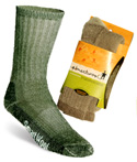
Finally, the product itself reinforces the look and feel to constantly remind the customer that this is the best and most comfortable pair of socks ever purchased. Every sock is emblazoned with the logo, and the ankle portion of the sock features our little glyph of a man, not screen printed on the sock but embroidered onto each and every sock. Even through this addition to the sock represents as much cost as the manufacture of the rest of the sock, it's worth every penny to the company in terms of recognition and reinforcement of the brand's look and feel.
|
|||||||||||||||||||||||||
| T | ||||||||||||||||||||||||||


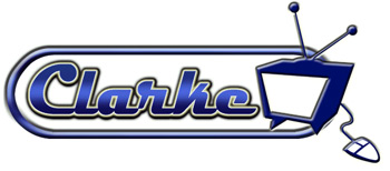
 We
found it. It looks very Chevy. The best way to sell a
seemingly complex technology is to evoke nostalgia. The
comparison of today's "computers as an entertainment,
news and communication media to the emergence of television
in the '50s is just too good to not capitalize on it.
But as you can see, the letters by themselves don't make
a logo. We need to figure out a way to unify all the elements
into one cohesive graphic.
We
found it. It looks very Chevy. The best way to sell a
seemingly complex technology is to evoke nostalgia. The
comparison of today's "computers as an entertainment,
news and communication media to the emergence of television
in the '50s is just too good to not capitalize on it.
But as you can see, the letters by themselves don't make
a logo. We need to figure out a way to unify all the elements
into one cohesive graphic. 


 Chapter
1: Research
Chapter
1: Research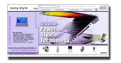 Sony
Corporation
Sony
Corporation
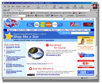
 Dell
and Gateway Computers
Dell
and Gateway Computers


 This
is a lesson about the importance and value of a product line's
look and feel. Look and feel (L&F) are extremely important
assets that, with the growth and popularity of a brand, can
become the most important equity of a company. In fact, in instances
when a poorly run company discovers it has a popular brand,
look and feel become the only value equity it has, and the instruments
of production, such as employees, factories, and machines, become
a liability. As we've seen many times in our economy, another
company, looking to acquire a particular brand for themselves,
will buy the company just for the brand, selling off the rest.
This
is a lesson about the importance and value of a product line's
look and feel. Look and feel (L&F) are extremely important
assets that, with the growth and popularity of a brand, can
become the most important equity of a company. In fact, in instances
when a poorly run company discovers it has a popular brand,
look and feel become the only value equity it has, and the instruments
of production, such as employees, factories, and machines, become
a liability. As we've seen many times in our economy, another
company, looking to acquire a particular brand for themselves,
will buy the company just for the brand, selling off the rest.
 The
company funnels most of its marketing dollars into point-of-purchase
displays in retail stores. There are no national ads, no television
commercials (yet). The store displays are unique in that they
separate their product line from all the rest of the socks a
store may carry. To attain this profile, wholesale distributors,
under the strict control of Smartwool, carefully counsel retailers
on how to display and sell the product one customer at a time.
The
company funnels most of its marketing dollars into point-of-purchase
displays in retail stores. There are no national ads, no television
commercials (yet). The store displays are unique in that they
separate their product line from all the rest of the socks a
store may carry. To attain this profile, wholesale distributors,
under the strict control of Smartwool, carefully counsel retailers
on how to display and sell the product one customer at a time.
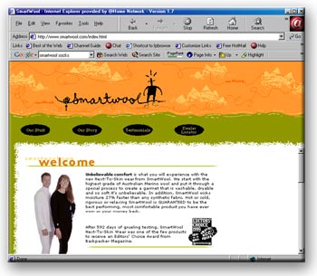 Smartwool's
Web site (
Smartwool's
Web site (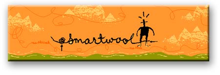
 Packaging
Completes the Look: The packaging is actually the logo wrapped
around each and every pair of socks. The company obviously understands
the value of continuity. Let's say we cast aside the labels,
logo, color scheme, and take the Smartwool socks stapled together
and thrown into the bins with the rest of the socks. Would they
sell as well? Probably not. Regardless of how well they are
made, they would not likely distinguish themselves from the
rest of the socks. But wrap them in the appropriate packaging,
give them their own informative display in the retail space,
the orange packaging becomes a beacon, an attractant, and, in
time, recognition among a conditioned clientele.
Packaging
Completes the Look: The packaging is actually the logo wrapped
around each and every pair of socks. The company obviously understands
the value of continuity. Let's say we cast aside the labels,
logo, color scheme, and take the Smartwool socks stapled together
and thrown into the bins with the rest of the socks. Would they
sell as well? Probably not. Regardless of how well they are
made, they would not likely distinguish themselves from the
rest of the socks. But wrap them in the appropriate packaging,
give them their own informative display in the retail space,
the orange packaging becomes a beacon, an attractant, and, in
time, recognition among a conditioned clientele.