Lawlor Family and the Galena Cellars Winery
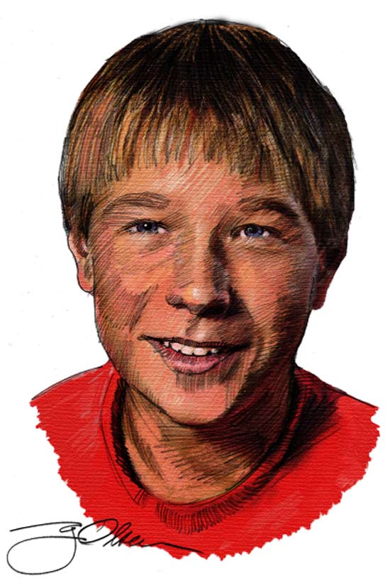
I prepared a new black and white sketch and then I colored it in the version below.
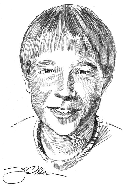
Here's Eric, as a drawn above, and then colored with textured pastels below.
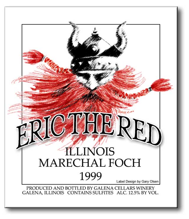
Two color label (black and red) printed on buff stock.
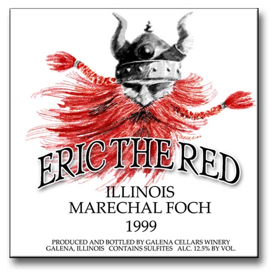
The client wanted a cleaner look with less shading than I had in the version below:
 My
friend and client, Christina Lawlor, a winemaker from Galena, Illinois,
commissioned me to do two labels for wines she has named for her two
children, Eric and Britt. Both labels are to be printed in two colors
on a buff stock. Limited color can be a real challenge these days when
so much is printed in full color, and it's relatively easy to design
in full color. In fact I would have to say it is much more difficult
to design something with real impact in two color than four color process.
Plus, when using a spot color strategy, one must consider such things
as traps and chokes to accommodate the printing process. Traps and chokes
refer to the reduction or expansion of adjoining colors in the color
separations to reduce registration issues if the paper stock drifts,
shrinks or expands on the printing press. I've been around long enough
to remember what it was like to do this process mechanically using film
and darkroom techniques. The software I use now pretty much compensates
for these problems, but not entirely. I often do my own mechanicals
to make sure there will be no surprises when the job is on the press.
My
friend and client, Christina Lawlor, a winemaker from Galena, Illinois,
commissioned me to do two labels for wines she has named for her two
children, Eric and Britt. Both labels are to be printed in two colors
on a buff stock. Limited color can be a real challenge these days when
so much is printed in full color, and it's relatively easy to design
in full color. In fact I would have to say it is much more difficult
to design something with real impact in two color than four color process.
Plus, when using a spot color strategy, one must consider such things
as traps and chokes to accommodate the printing process. Traps and chokes
refer to the reduction or expansion of adjoining colors in the color
separations to reduce registration issues if the paper stock drifts,
shrinks or expands on the printing press. I've been around long enough
to remember what it was like to do this process mechanically using film
and darkroom techniques. The software I use now pretty much compensates
for these problems, but not entirely. I often do my own mechanicals
to make sure there will be no surprises when the job is on the press.
 The
design above was particularly challenging because of the amount of red
in Eric's beard. I knocked out the red behind the black lettering so
the ink wouldn't turn the black to a brown on the bold type. Just a
precaution. The original drawing of Eric The Red was actually performed
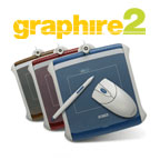
using a Wacom Tablet which features a pressure sensitive pen that simulates
a pastel stick (or a paintbrush, airbrush, etc.). The pen allegedly
has 500 levels of sensitivity. It is amazing tool. It also comes with
a wireless mouse, and the whole thing works with my computer's USB connection.
The tablet can be used on both a Mac and PC.
The
design above was particularly challenging because of the amount of red
in Eric's beard. I knocked out the red behind the black lettering so
the ink wouldn't turn the black to a brown on the bold type. Just a
precaution. The original drawing of Eric The Red was actually performed
using a Wacom Tablet which features a pressure sensitive pen that simulates
a pastel stick (or a paintbrush, airbrush, etc.). The pen allegedly
has 500 levels of sensitivity. It is amazing tool. It also comes with
a wireless mouse, and the whole thing works with my computer's USB connection.
The tablet can be used on both a Mac and PC.
I normally would have sketched this drawing out on paper for the finish then scan it into the computer for further editing. But I was experimenting with this sketch on the Wacom, and it turned out so well, I decided to use it rather than redraw it.
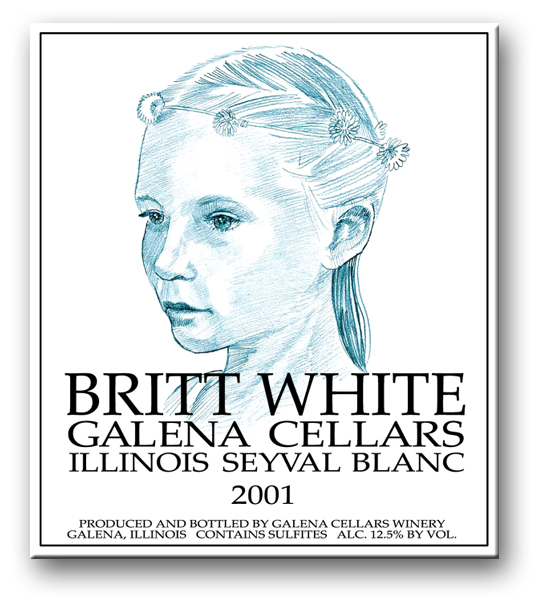
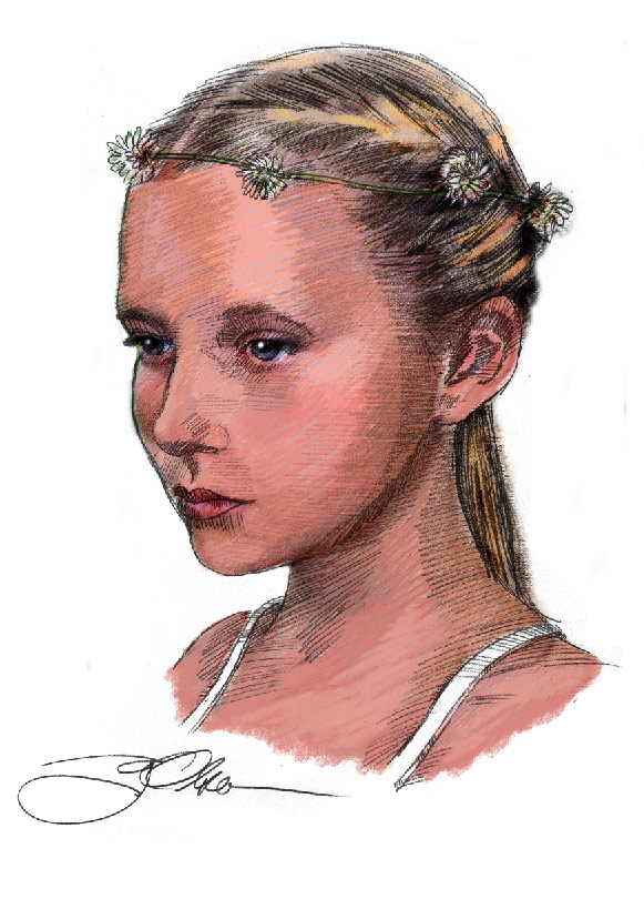
Two color label (blue and black) printed on a buff stock.
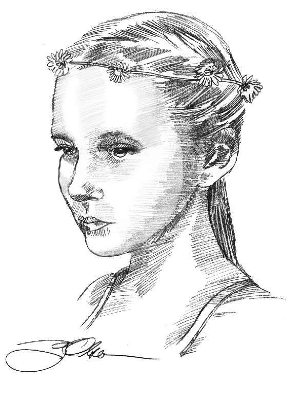
 This
label actually features a hand-drawn portrait of Britt for whom the
wine has been named. I wanted the portrait to look like it was rendered
by an artist using vine charcoal in the 16th Century. Vine charcoal
was actually made from grape vines. I couldn't tell you where my last
piece of vine charcoal is (I used it in life drawing class when I was
a pup). Instead, I used a soft leaded pencil, scanned the art into my
computer where I tweaked the contrast, then colored the drawing a shade
of blue.
This
label actually features a hand-drawn portrait of Britt for whom the
wine has been named. I wanted the portrait to look like it was rendered
by an artist using vine charcoal in the 16th Century. Vine charcoal
was actually made from grape vines. I couldn't tell you where my last
piece of vine charcoal is (I used it in life drawing class when I was
a pup). Instead, I used a soft leaded pencil, scanned the art into my
computer where I tweaked the contrast, then colored the drawing a shade
of blue.
I could never have had this much control over a design before the computer came along. My tools now include a nice set of mechanical pencils with leads of varying degrees of softness. My laptop computer with PhotoShop and my Epson scanner complete my list of essential tools to get the job done. Oh, I almost forgot. I use a soft Bristol finish paper (heavy grade) for the drawing. I retouch the image in PhotoShop, masking, erasing, and otherwise improving on the image. -G.O.